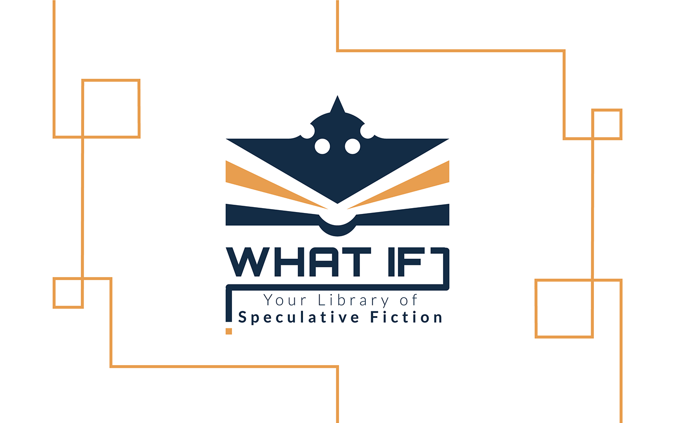
What If? Library
LOGO and BRAND IDENTITY for a speculative fiction library (Sci-Fi, Fantasy & Horror)
ROLE
Brand's concept, logo and brand identity design
DATE
2022
DESIGN BRIEF /
CHALLENGE
The project involves creating a brand identity for a (fictional) library specialising in speculative fiction. The library aims to provide an accessible, informal space where fans can explore, discuss, and create stories while feeling part of a tolerant, collaborative, and creative community. The design should also reflect the brand's imaginative personality. Deliverables include signage, online and physical membership cards, merchandise and some digital advertisement for social media.
LOGO DESIGN
TOOLS
Illustrator, Photoshop
KEY RESULT
A combination mark consisting of an icon and wordmark, designed to convey a playful, explorative, and friendly image. This flexible solution adapts seamlessly to both digital and physical applications with a strong visual system, creating a distinctive brand identity that sets it apart from other speculative fiction libraries.
** This is a fictional library I created for a university project. I was responsible not only for the visual design, but also for establishing the brand's personality and a distinctive naming which would stand out among existing libraries specialising in this type of literature **
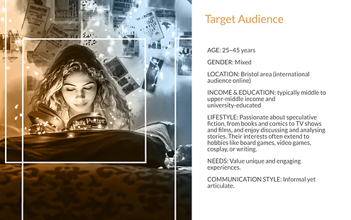
01 Empathy | Understanding the library
BUSINESS TYPE: Specialist Library in Speculative Fiction
(which includes Science Fiction, Fantasy, and Horror)
LOCATION: Urban centre of Bristol (UK)
CHARACTER
-
Mission: To make speculative fiction accessible and well-known by providing an informal, welcoming space for fans to discuss, share interests, enjoy books, or create their own stories.
-
Vision: To inspire fantasy and imagination - anything is possible!
-
Tone/Personality: Enthusiastic, approachable, informal, tolerant, imaginative, and collaborative.
-
Values: Promoting respect and diversity, fostering community through activities, and encouraging creativity and collaboration.
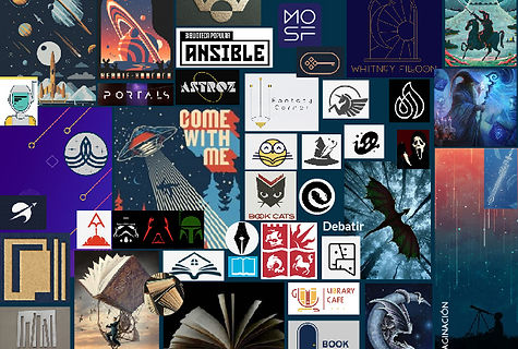
02 Benchmark
After gaining an understanding of the business, I analysed the visuals and brand identities of existing competitors and other projects linked to speculative fiction.
Such research process served as both a source of inspiration and a way to identify key opportunities to differentiate the brand.

03 Ideation
After understanding the character of the business, and the visuals used by the competition, I created a word/concept map as a brainstorming tool, using keywords associated with the business and the theme of speculative fiction.
This process guided the research for visuals and the development of an inspiration moodboard, which was a base to start sketching and exploring different concepts.
CONCEPT MAPPING

MOODBOARD
CONCEPT SKETCHING

04 Design refinement
After selecting the logo concept, I refined and vectorised the design. I used a diagonal grid (30º angle for the main logo mark and 45º for the special version) to construct a proportionally balanced logo mark which remained consistent across all of its variations.
The 30 and 45º angles emphasised diagonal shapes, resulting in a dynamic and playful design.


05 Design presentation


Project Credits
The What If? Library is a fictional library defined and designed by Marta Andrés for a university project at UOC