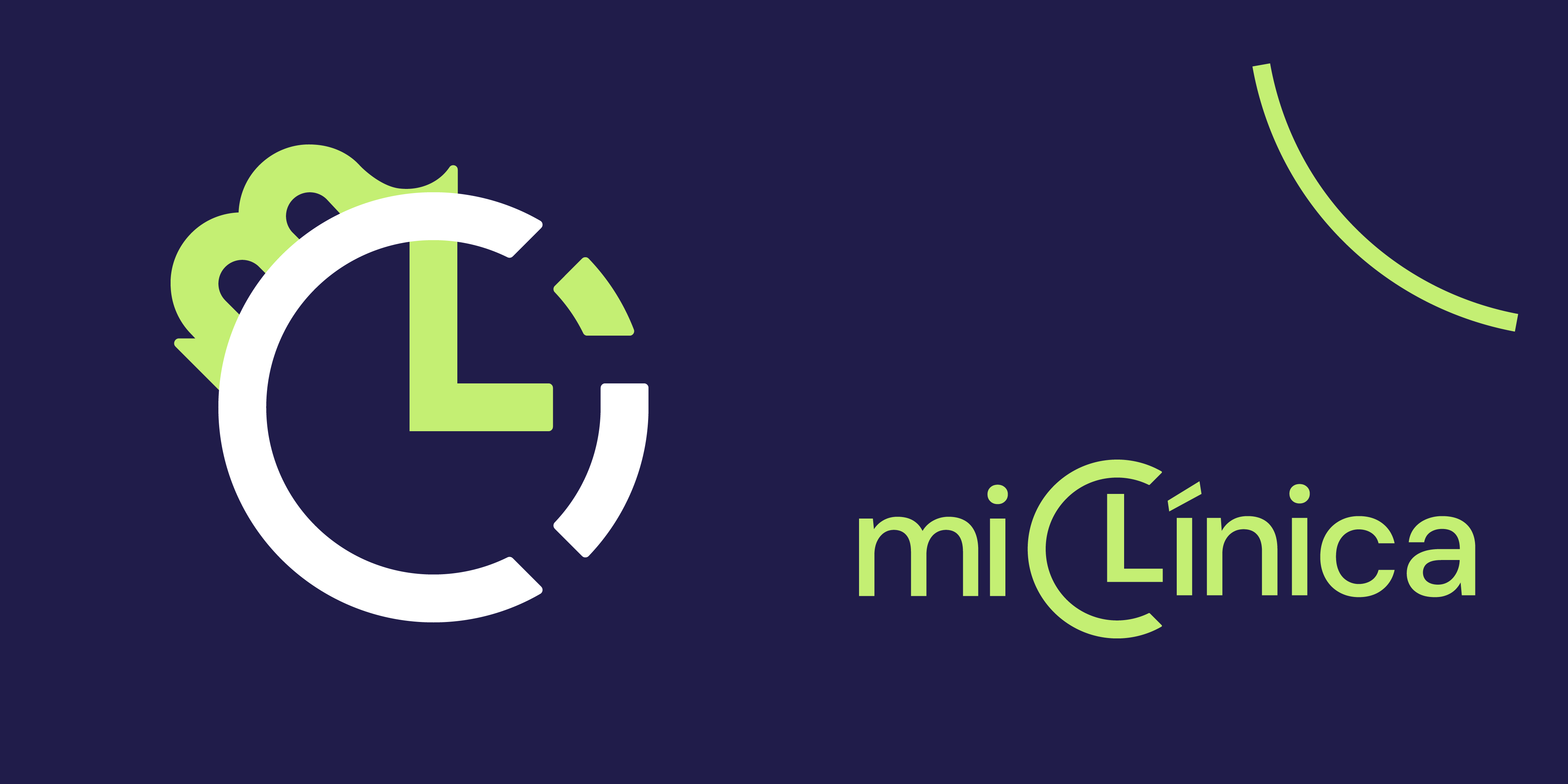
miClínica
LOGO design for an online B2B/B2C appointment booking service
ROLE
Logo and application design
DATE
2024
LOGO DESIGN
TOOLS
Illustrator, Photoshop
DESIGN BRIEF /
CHALLENGE
The service offers an efficient, time-saving solution for managing and booking appointments online for medical and aesthetic businesses, ensuring a smooth experience for both providers (B2B) and their clients (B2C). As a new startup, the client initially requested a logo for their website, but a full brand identity was proposed instead to support a stronger, more strategic foundation for their business identity.
KEY RESULT
A minimalist logo combining a clock with the letters "CLI" (from clínica) reflects the brand’s focus on time-saving and professionalism. The dark blue and modern green and orange colour palette suggests trust, innovation, and approachability.
01 Strategy
TIME SAVING
EFFICIENCY
APPROACHABLE
1.1 Understanding the Service and building Empathy
Using both a client questionnaire and through a client call, I wanted to undertand all about this new service: what makes them different? what's their purpose, mission and vision? what type of audience are they targetting? are there similiar services out there?
I then understood they wanted to provide a service that made life easier for both the businesses who receive the bookings, and the people booking their services: all bookings online and in one place, with no more waiting, wasting time over the phone.
Therefore, the concept of approachability and time saving and efficiency formed the main core of the type of service miClinica wanted to provide.
TARGET AUDIENCE
30-45 yrs old
Entrepreneurs with small businesses
Limited IT knowledge
With young clients who prefer booking online

1.2 Competitor Analysis
Due to time constraints, a basic competitor analysis was conducted, primarily focusing on the colors, typography and imagery used by similar businesses.
The goal was to create a logotype that did not fully follow the industry trends, especially in terms of colours, so it would be more distinctive.

02 Concept ideation
After analyzing the iconography and styles used by competitors, I conducted a concept mapping session to connect words and visual ideas related to time efficiency and the brand name.
This process led to several sketched concepts, which were presented to the client.
Ultimately, they chose the clean typographic version which integrates the business name with a clock representation.

03 Design presentation


Project Credits
Business name and business idea by Vicente Verdú
All designs by Marta Andrés